This isn’t particularly about yesterday’s eclipse. That’s just a particularly extreme example of something face by every photographer working in color: Color is (deeply) problematic. For physical reasons it’s impossible to exactly reproduce natural or real color in a photograph, or any printed medium. Pigment on a surface simply cannot reproduce the dynamic range (contrast between light and dark) the eye can handle in a real setting. The reduced range means that compromises must be made.
The problem is particularly acute, and thus interesting, when shooting the sun, which, obviously, is what you’re doing when you photograph the sun. The sun is bright, so bright that you cannot/should not look directly at it (for more than a few seconds). It floods the camera with light, overloading the censor (I’m shooting digital). You can deal with the problem by using a neutral density filter to cut down the light entering the camera, but I don’t have one. Just my Pentax 7-D and a Tamron 75-300 mm lens.
Here’s an eclipse shot as it came out of the camera:
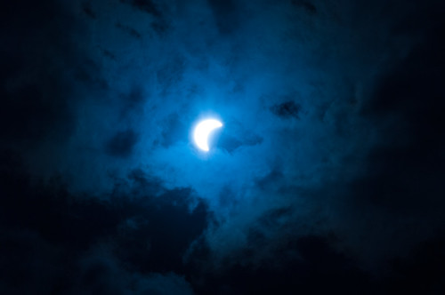
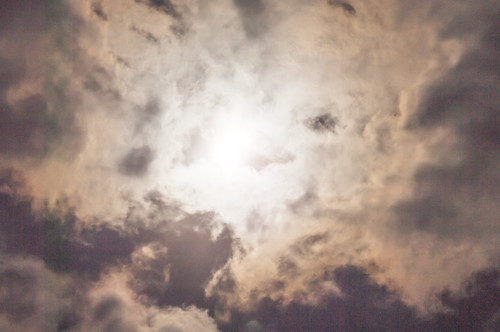
Very dark, and very blue. That’s NOT what I saw, standing there looking at the eclipse. I saw (mostly) white clouds, with a bit of blue peeking through here and there, and the crescent sun shining through. That sun show’s up as white on the screen (printed surface). As bright as you can physically get. And the clouds are black. The difference in brightness may well approximate that in the scene (the camera’s sensors can record a wider range than can be displayed), but when mapped onto the viewable spectrum that difference forces the clouds to be all but black so that the sun can be merely white (rather than radiating light so intense that it hurts your eyes).
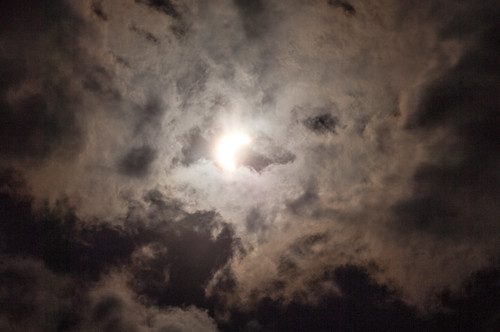
Here’s the first step I took toward producing a more satisfactory image:
I reset the white balance to get rid of most of the blue. What’s white balance? You tell the software, this is the shade that I want to appear as white, and it recalibrates the image so that everything else is consistent with that.
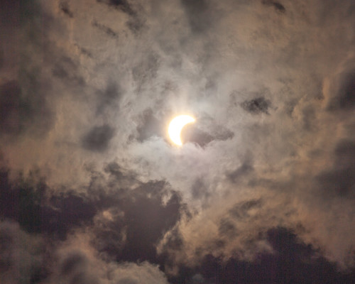
But it’s still rather dark. He’s an attempt to deal with that:
Overall, it’s lighter. There’s more definition in the clouds. But it’s still pretty dark and the sun-disk is loosing its definition. A couple clicks more in that direction and the sun will become an undefined mass of light. Like this:
I DO like it. It’s a nice image, it’s lighter, though still darkish. But the sun disk has disappeared.
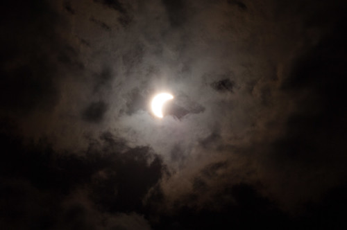
How about this?
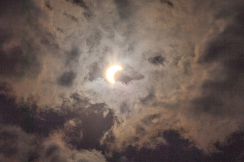
Not quite so light as the previous image. Yet the's still definition and differentiation in the clouds. And the sun disk is (more or less) preserved.
But it’s still not what I saw out doors with the naked eye. It is not physically possible to produce that. You’ve got to make compromises.
In any event, just what DOES it mean to see the sun with your naked eye? The sun is not something you can look at in a more than glancing fashion. It a sense, it doesn’t have a (fully) ‘natural’ appearance.
For us, the sun is always, in a sense, a bit human.
* * * * *
The image at the top of this post is a cropped version of the bottom image.
And here's another post on the same topic, the problematics of color.
And here's another post on the same topic, the problematics of color.
No comments:
Post a Comment